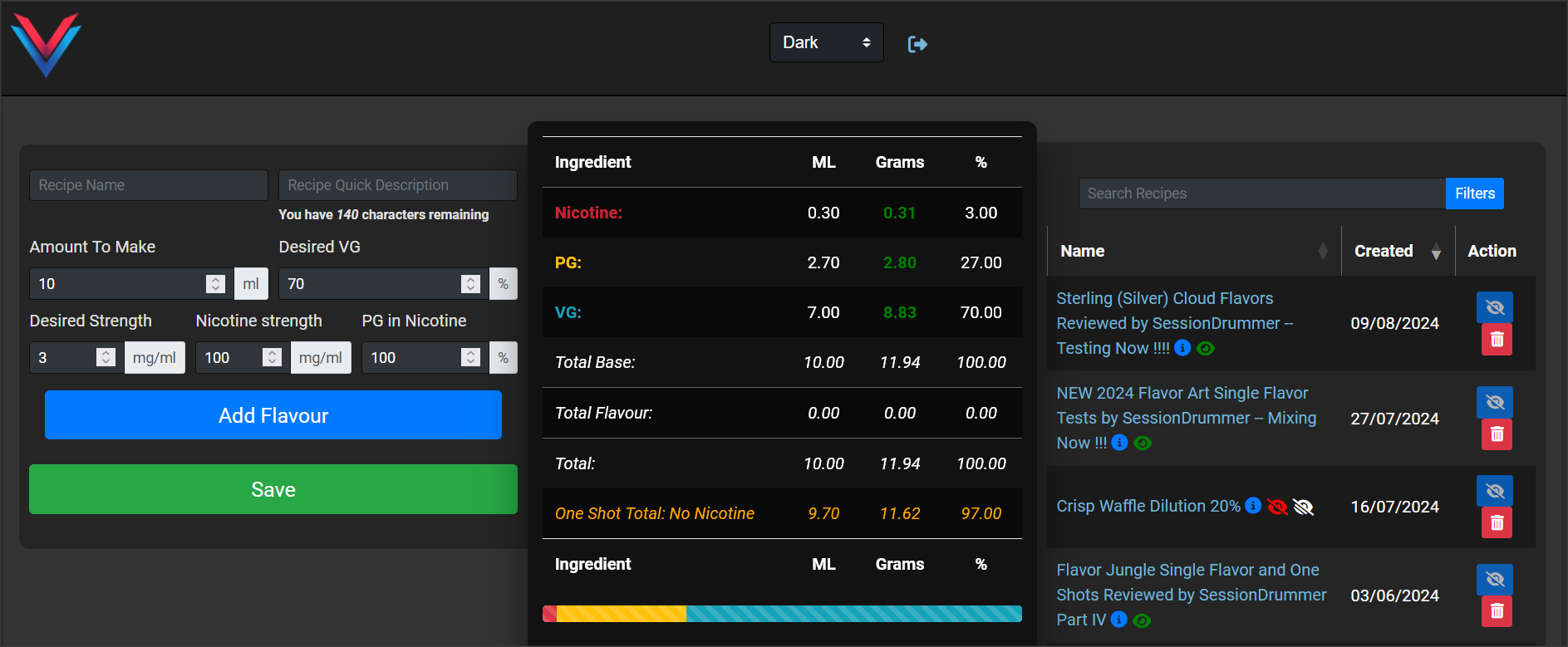
@Grubby, back in the lab on the mixing netbook, and the VCC seems to be stuck in Light Mode, and although I have my preferences set to Dark on the VC, I can find no settings or options withing the VCC to change it.
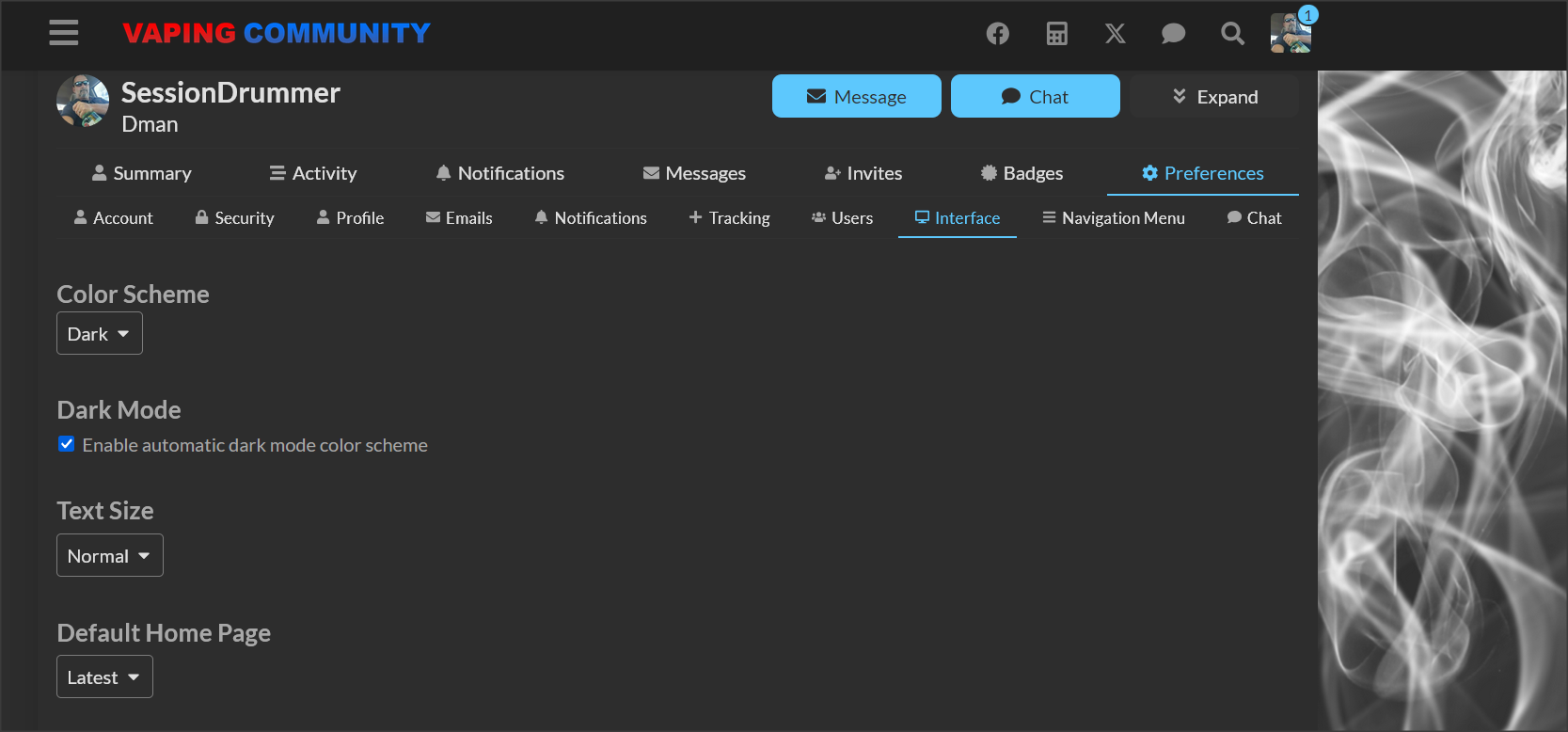
The Tiny VCC has a option choice …
@Grubby, back in the lab on the mixing netbook, and the VCC seems to be stuck in Light Mode, and although I have my preferences set to Dark on the VC, I can find no settings or options withing the VCC to change it.
The Tiny VCC has a option choice …
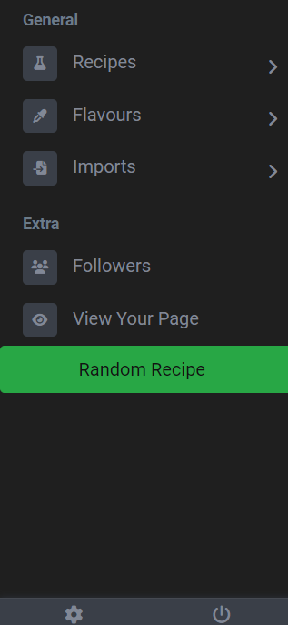
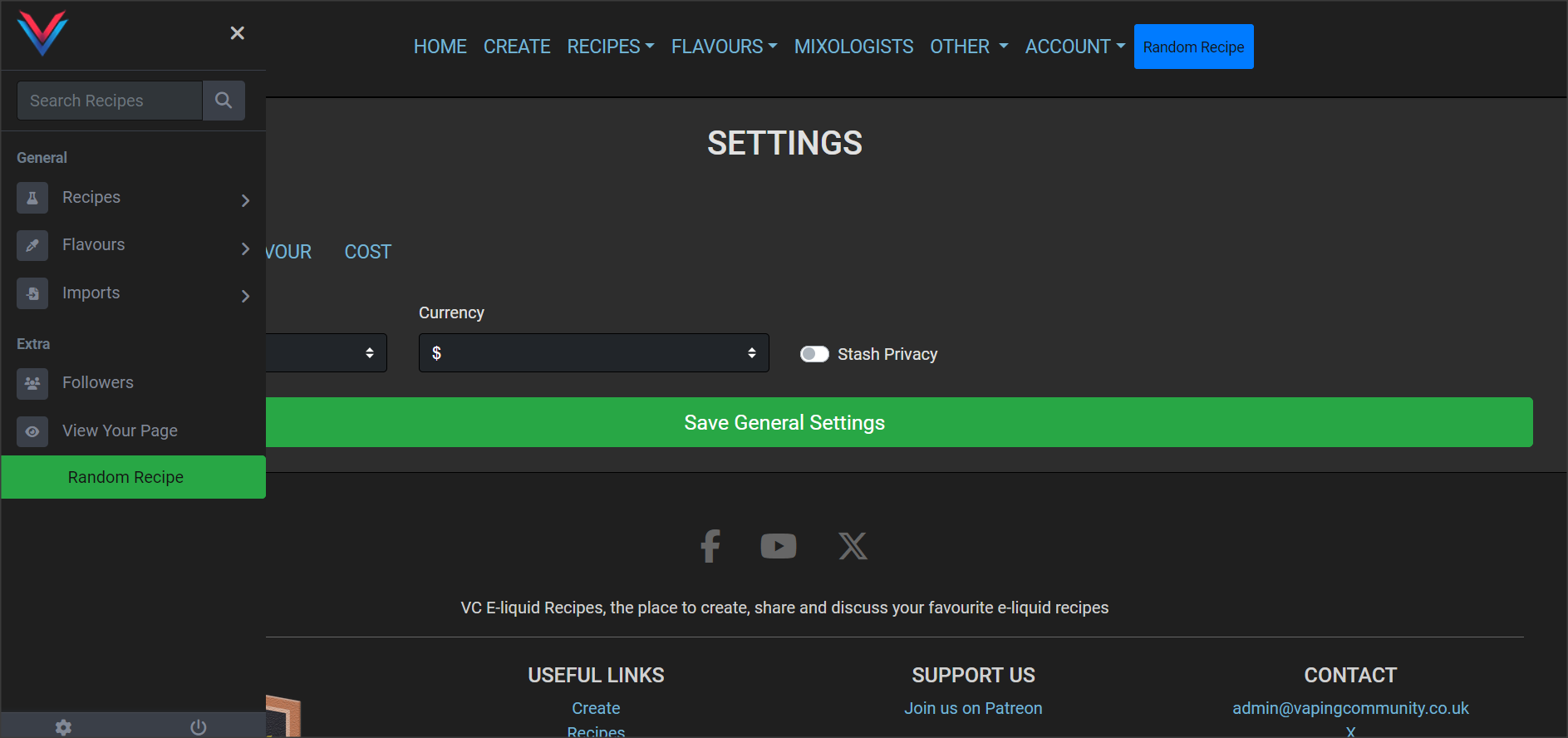
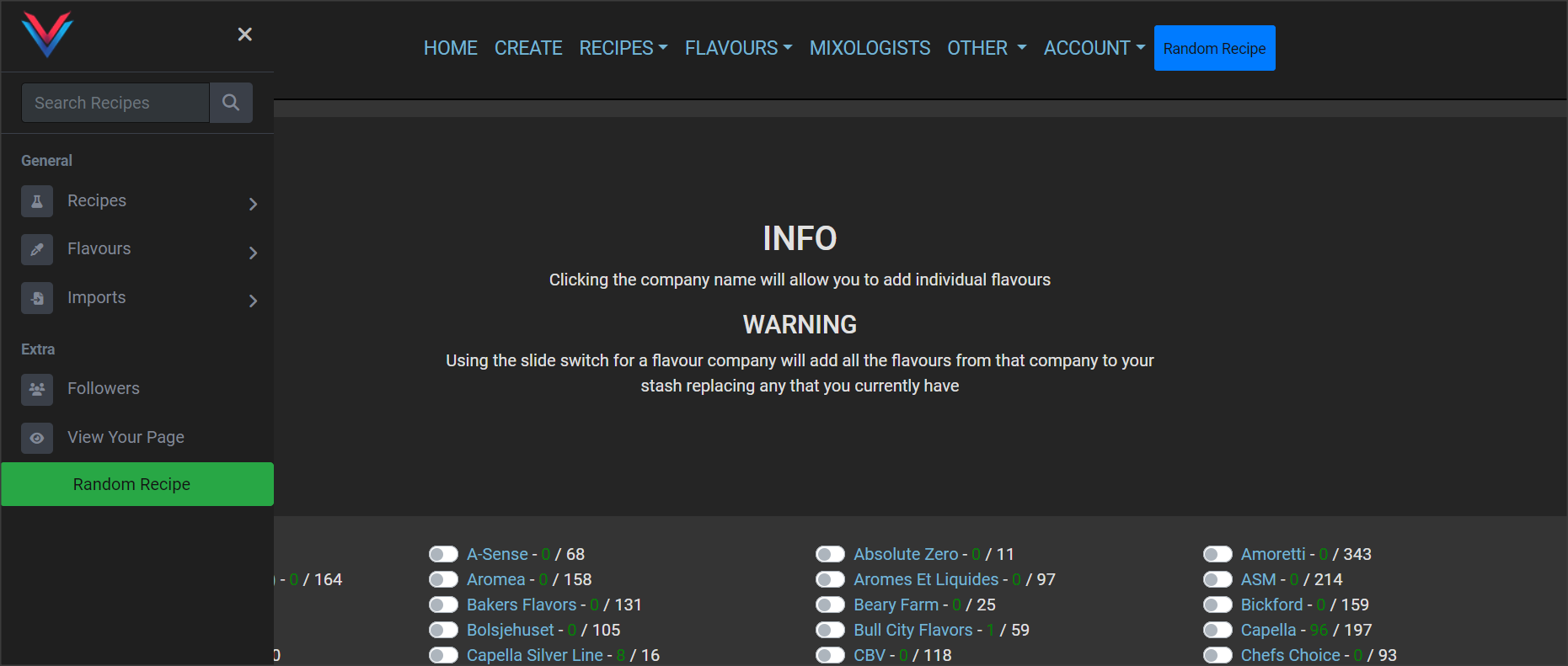
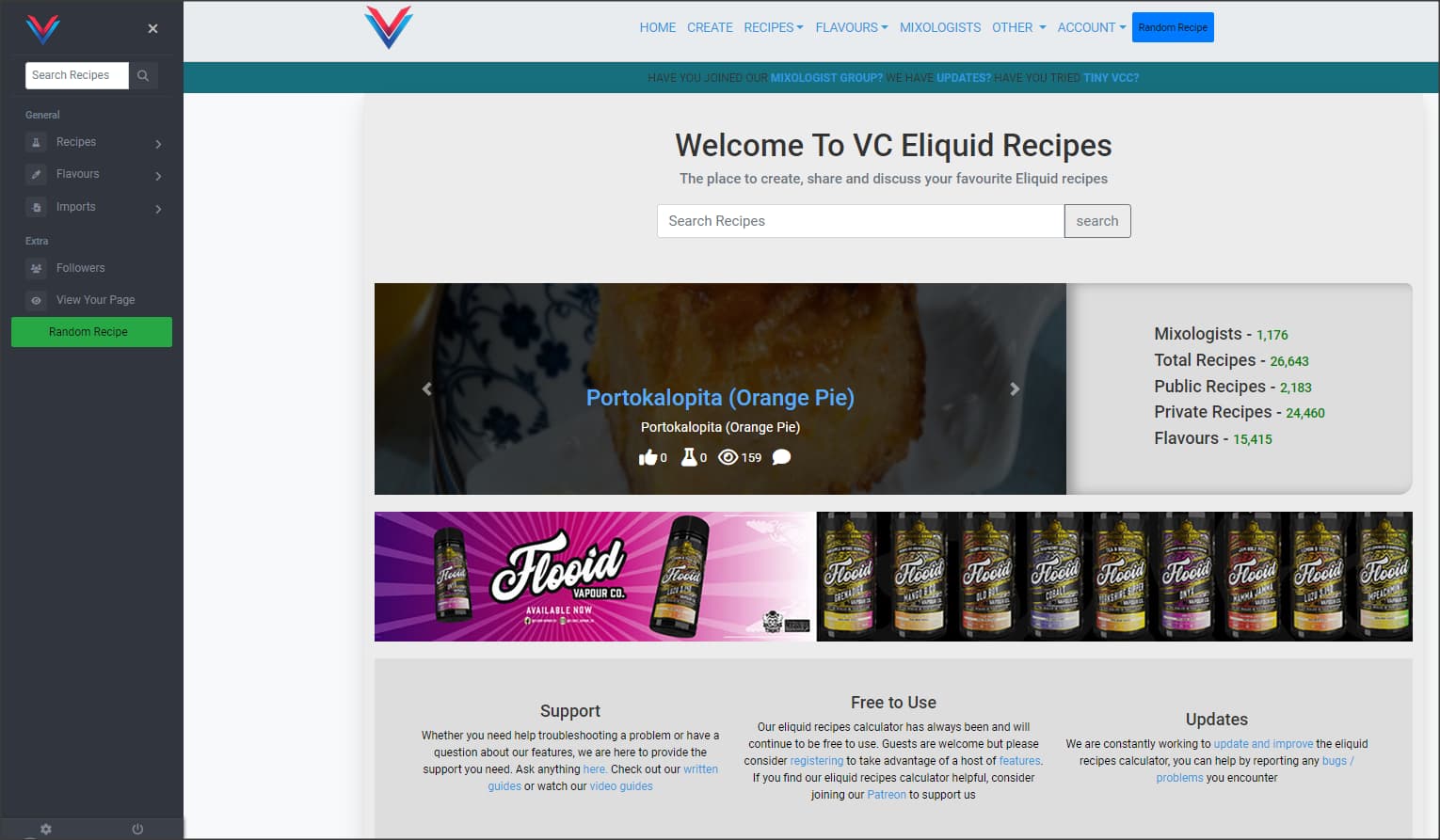
The cog at the bottom of the menu… It gets covered up by the URL in the browser if you hover over a link
Hmmmm, that’s rather not intuitive IMO. Very hard to find, and even harder to click. Also, look at how the initial load looks after actually hitting it. Since the menu is already called (open), it blocks options on the initial load …
I don’t use mobile, so maybe it’s good on that, but on a laptop, netbook, it’s kind of …
I see why you’ve implemented the side menu, but from a user/usage standpoint, it’s cumbersome, as you end up having to open it, navigate, then close it as it blocks some of the new load. I’m just clicking around like a “user” to view stash, options, and I’m finding I have to open the menu, then close the menu, then open it again.
Going to think on this.
Was just working on a post about the same, SD. Ya beat me to it ![]()
Also, @Grubby , typically, tapping/clicking anywhere outside of an open sub menu will also close it, rather than/in addition to hitting the X.
iPhone 13 Pro Max
Yep finding the same thing, working on about 100 different things atm but will address that asap, cheers for the feedback
Would be helpful/more visible to make the settings/logout icons larger, at the bottom of that menu, too, @Grubby
Well, didn’t want to ADD to your list LOL. Loading/layout/graphics are easy to check/spot, but WORKFLOW, is much harder to test for, and/or explain.
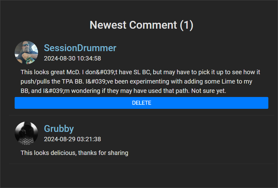
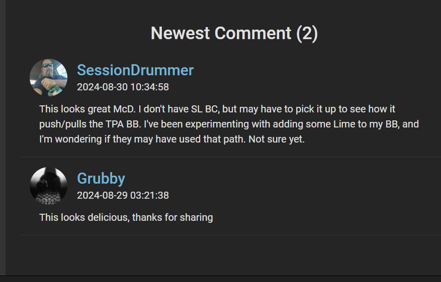
You’ll probably hate this, lol, and not sure if it’s new, old, unimportant, but I just noticed the apostrophe’s in recipe comments are being escaped ..
Sorry … ![]()
See something, say something …
Ongoing issue that I’m slowly resolving, I’ve fixed it for some places like the recipe list and recipe page but this is the feedback I need, there is over 50k lines of code, some “spaghetti” ![]()
Now I am doing NONE of the coding here, hehe, so easy to nitpick, but the initial load WITH the side menu open is kinda, ehhh …
It can seem a little confusing, as to what you have to do where. Top, side ?? Also with both of them open, redundant ?? Would the visuals, and workflow be improved by having ALL nav/options under ONE nav menu ?? Top only ?? Is there room to squeeze it in up top ?
Now I feel bad I brought it up. I literally JUST posted the comment and saw it. ![]()
I concur
I’m just throwing shit at the wall for @Grubby. I’ve BEEN where he is, and had all KINDS of complaints, suggestions, some good, some terrible, and the whole time I’m reading them, I’m thinking, “How in the hell can I code that”. I’ve ALSO been soo deep IN the coding/syntax, that I’ve MISSED workflow/usability issues, and/or didn’t really test, in the way a standard “User” would use the site/features.
It’s hard to explain, but as always, the fewer clicks the better, and the easier it is to use, the MORE people will use it.
You’re welcome, and I’m glad it was a QUICK one … ![]()
Agreed, I’ll jump on dev and absolutely nail this one ![]()
All valid points and I’m going to address them… Lunch first ![]()
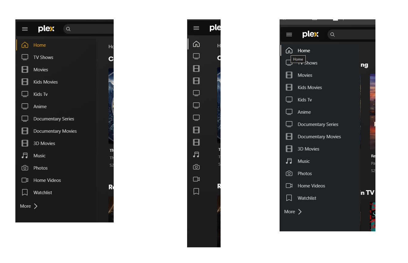
@Grubby i love the way Plex has implemented a similar menu
State 1 - menu is expanded and page content is contracted
State 2 - Minimised to just icons
State 3 - Mouseover any of the icons and the menu is expanded over the top of the page content
I sent you a video mate