There is a little bit of lag that will hopefully be removed when I get to it but it shouldn’t take minutes…
There is a little bit of lag that will hopefully be removed when I get to it but it shouldn’t take minutes…
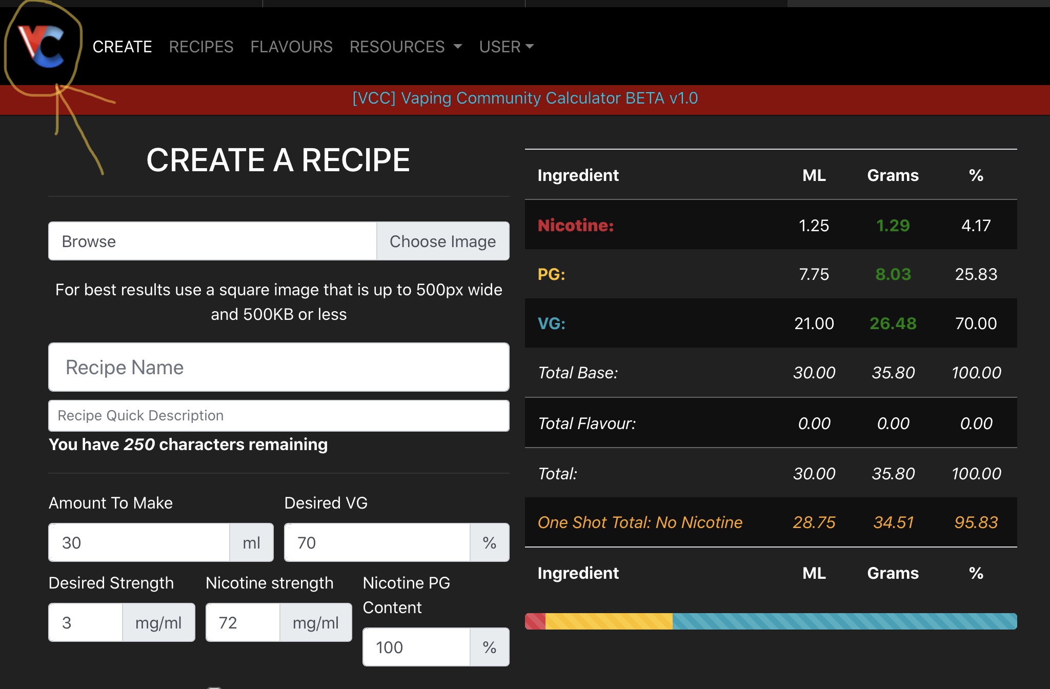
Not sure if this a bug, suggestion, or has already been covered. But I find the vccalc. landing page to be CREATE A RECIPE page ![]()
Even from the VC home button it goes to CREATE ;
Dammit @whthek, I thought you said you were going to STOP copying me !!!. Don’t worry mate, I was typing in flavor names, not finding any results under the Master Flavour List, and RIGHT SMACK DAB in the middle of the screen was a MFG Name dropdown list. Wait, where’d THAT come from ?? !!!
@Rocky02852, if I remember correctly @Grubby was going to put the landing page through a total overhaul. My memory’s failing, so, hehe.
Oh ok, thought I might of missed something, I know @Grubby‘s hard at work on this thing and it’s looking Great, just thought I’d throw it out there ![]()
No you’re doing spot on. See something SAY something !!!
SD, you know what ‘they’ say,don’t you…imitation is the highest form of flattery, ![]()
Seriously though, I could confuse the hell outta anyone when I let my yapper or my typing speed get out ahead of the electrical activity occurring in that ball resting on my shoulders!
The homepage is being revamped.
Just out of interest, what device are you viewing the calculator on??
iPad and / or iPhone ![]()
Thanks ![]()
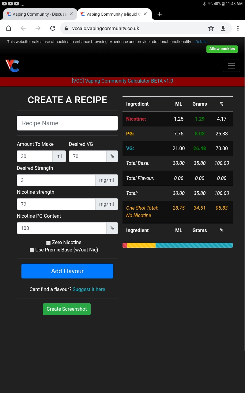
This is on a Galaxy Tab
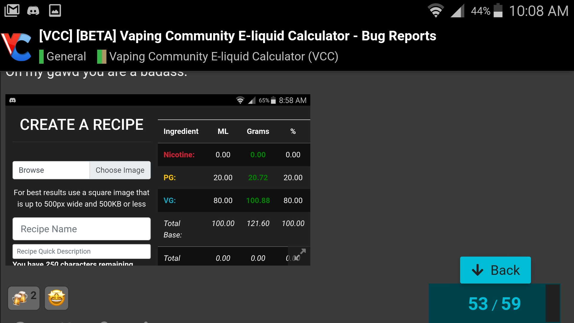
On my Galaxy phone, in portrait mode the recipe summary is at the bottom instead of on the side as in the tablet screen above, which is perfect for the smaller screen of the phone. In landscape mode though on the phone I see this…
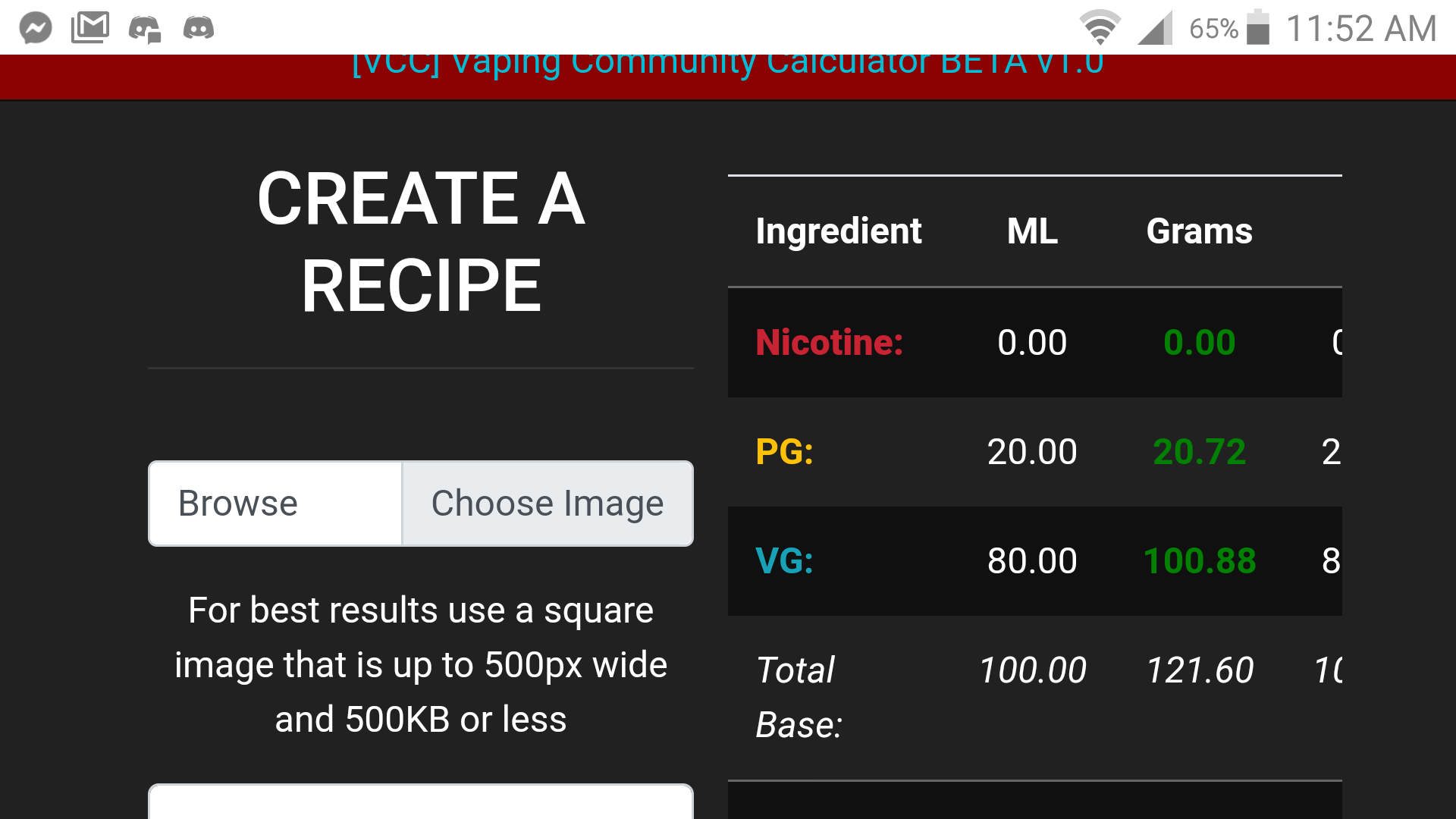
Can you try view the calculator on mobile landscape again please, I think I fixed it… ![]()
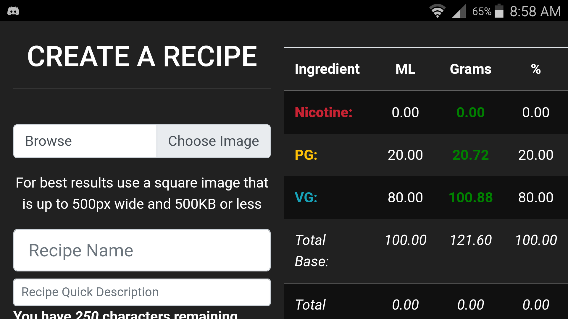
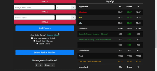
Long flavour names will make the table look crap as it will wrap the text but it’s viewable, awesome
The text entry boxes could be shrunk by about 25% and still be easily readable and clickable, even for terrible eyes and fat fingers. If that helps you gain some space.
The column they are in will not allow for any more space regardless of the input width but thanks anyway ![]()
You can see in this gif how the adaptive framework works
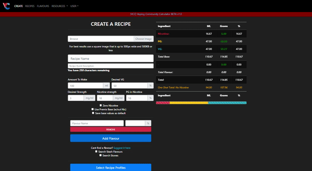
I guess what I mean is the cellpadding and font could be smaller, allowing more room for text in the fields.
That would theoretically decrease the vertical size of the box, making it a smaller area on my phone to click in. And as I said, right now is easily clickable on my lil S5. The cellpadding alone will allow a few more characters. And the font size could be dropped a few points maybe, allowing a few more.
Hope that makes sense lol.
DO NOT stare at this ^^GIF^^ for more than 5 seconds…or you will become cross-eyed, and/or irreversibly claustrophobic. ![]()
To give you an idea, this is a screenshot of my screenshot as displayed here in the forum…
Now, if I pretend that image is the calculator on my phone, at that size on my phone, is about 50% of original. That is a tad bit too small for my fingers. So you should be able to see a 25% reduction to the height of those fields is easily in the range they would work great. Sorry if this is confusing. I have a hard time explaining this shit in my cauliflower.